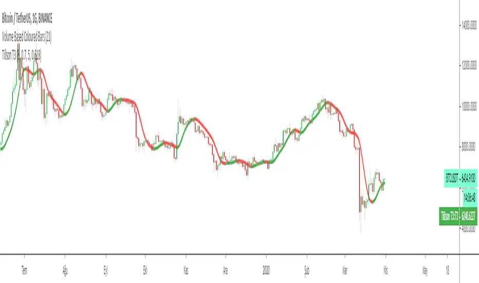
Tillson T3 Moving Average by KIVANÇ fr3762Developed by Tim Tillson, the T3 Moving Average is considered superior to traditional moving averages as it is smoother, more responsive and thus performs better in ranging market conditions as well. However, it bears the disadvantage of overshooting the price as it attempts to realign itself to current market conditions.
It incorporates a smoothing technique which allows it to plot curves more gradual than ordinary moving averages and with a smaller lag. Its smoothness is derived from the fact that it is a weighted sum of a single EMA , double EMA , triple EMA and so on. When a trend is formed, the price action will stay above or below the trend during most of its progression and will hardly be touched by any swings. Thus, a confirmed penetration of the T3 MA and the lack of a following reversal often indicates the end of a trend.
The T3 Moving Average generally produces entry signals similar to other moving averages and thus is traded largely in the same manner. Here are several assumptions:
If the price action is above the T3 Moving Average and the indicator is headed upward, then we have a bullish trend and should only enter long trades (advisable for novice/intermediate traders). If the price is below the T3 Moving Average and it is edging lower, then we have a bearish trend and should limit entries to short. Below you can see it visualized in a trading platform.
Although the T3 MA is considered as one of the best swing following indicators that can be used on all time frames and in any market, it is still not advisable for novice/intermediate traders to increase their risk level and enter the market during trading ranges (especially tight ones). Thus, for the purposes of this article we will limit our entry signals only to such in trending conditions.
Once the market is displaying trending behavior, we can place with-trend entry orders as soon as the price pulls back to the moving average (undershooting or overshooting it will also work). As we know, moving averages are strong resistance/support levels, thus the price is more likely to rebound from them and resume its with-trend direction instead of penetrating it and reversing the trend.
And so, in a bull trend, if the market pulls back to the moving average, we can fairly safely assume that it will bounce off the T3 MA and resume upward momentum, thus we can go long. The same logic is in force during a bearish trend .
And last but not least, the T3 Moving Average can be used to generate entry signals upon crossing with another T3 MA with a longer trackback period (just like any other moving average crossover). When the fast T3 crosses the slower one from below and edges higher, this is called a Golden Cross and produces a bullish entry signal. When the faster T3 crosses the slower one from above and declines further, the scenario is called a Death Cross and signifies bearish conditions.
I Personally added a second T3 line with a volume factor of 0.618 (Fibonacci Ratio) and length of 3 (fibonacci number) which can be added by selecting the box in the input section. traders can combine the two lines to have Buy/Sell signals from the crosses.
Developed by Tim Tillson
在腳本中搜尋"moving average crossover"
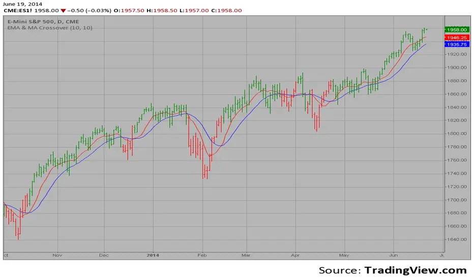
EMA & MA Crossover The Moving Average Crossover trading strategy is possibly the most popular
trading strategy in the world of trading. First of them were written in the
middle of XX century, when commodities trading strategies became popular.
This strategy is a good example of so-called traditional strategies.
Traditional strategies are always long or short. That means they are never
out of the market. The concept of having a strategy that is always long or
short may be scary, particularly in today’s market where you don’t know what
is going to happen as far as risk on any one market. But a lot of traders
believe that the concept is still valid, especially for those of traders who
do their own research or their own discretionary trading.
This version uses crossover of moving average and its exponential moving average.
Fibonacci Moving AveragesFibonacci Moving Averages - Advanced Trend Analysis Tool
This indicator plots multiple moving averages based on Fibonacci sequence numbers, providing a comprehensive view of market trends across different timeframes. The Fibonacci sequence naturally reflects market harmonics and psychological support/resistance levels.
KEY FEATURES:
📊 11 Fibonacci Period Moving Averages
- Short-term: 8, 13, 21, 34, 55, 89
- Long-term: 144, 233, 377, 610, 987
- Toggle each MA on/off individually
- Fully customizable colors for each period
⚙️ Flexible Configuration
- Choose between EMA (Exponential) or SMA (Simple) moving averages
- Adjustable line width (1-4 pixels)
- Custom source input (close, open, high, low, etc.)
- Clean, organized settings interface
🎯 Golden Cross / Death Cross Detection
- Automatic detection of major trend reversals
- Configurable fast and slow MA periods (default: 55/233)
- Visual signals with labeled triangles
- Green "GC" for bullish Golden Cross
- Red "DC" for bearish Death Cross
🔔 Built-in Alert System
- Golden Cross alerts for bullish trend changes
- Death Cross alerts for bearish trend changes
- Set once, receive notifications automatically
USAGE:
The Fibonacci Moving Averages work together to identify:
- Trend direction and strength
- Dynamic support and resistance levels
- Potential entry and exit points
- Market regime changes (trending vs ranging)
When price is above the Fibonacci MAs, it indicates bullish momentum. When below, bearish momentum. The spacing between MAs shows trend strength - wider spacing indicates stronger trends, while convergence suggests consolidation or potential reversal.
IDEAL FOR:
- Swing traders identifying medium to long-term trends
- Day traders using multiple timeframe analysis
- Position traders seeking major trend changes
- Any trader using moving average crossover strategies
TECHNICAL NOTES:
- Pine Script v6 - Latest version with optimized performance
- Overlay indicator - plots directly on price chart
- Minimal resource usage despite multiple calculations
- Compatible with all timeframes and markets
Default settings show 6 MAs (8, 13, 21, 34, 55, 89) for clarity, but you can enable all 11 for comprehensive analysis. The Golden/Death Cross feature uses the 55/233 combination by default, representing the classic short-term vs long-term trend relationship.
Perfect for traders who understand that markets move in natural rhythms and want to align their analysis with the mathematical patterns found throughout nature and finance.

MA Table [RanaAlgo]The "MA Table " indicator is a comprehensive and visually appealing tool for tracking moving average signals in TradingView. Here's a short summary of its usefulness:
Key Features:
Dual MA Support:
Tracks both EMA (Exponential Moving Average) and SMA (Simple Moving Average) signals (10, 20, 30, 50, 100 periods).
Users can toggle visibility for EMA/SMA separately.
Clear Signal Visualization:
Displays Buy (▲) or Sell (▼) signals based on price position relative to each MA.
Color-coded (green for buy, red for sell) for quick interpretation.
Customizable Table Design:
Adjustable position (9 placement options), colors, text size, and border styling.
Alternating row colors improve readability.
Optional MA Plots:
Can display the actual MA lines on the chart for visual confirmation (with distinct colors/styles).
Usefulness:
Quick Overview: The table consolidates multiple MA signals in one place, saving time compared to checking each MA individually.
Trend Confirmation: Helps confirm trend strength when multiple MAs align (e.g., price above all MAs → strong uptrend).
Flexible: Suitable for both short-term (10-20 period) and long-term (50-100 period) traders.
Aesthetic: Professional design enhances chart clarity without clutter.
Ideal For:
Traders who rely on moving average crossovers or price-MA relationships.
Multi-timeframe analysis when combined with other tools.
Beginners learning MA strategies (clear visual feedback).

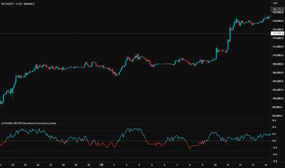
52SIGNAL RECIPE Directional Consistency Index═══ 52SIGNAL RECIPE Directional Consistency Index (DCI) ═══
◆ Overview
52SIGNAL Directional Consistency Index (DCI) is a technical indicator that measures the directional consistency of market movements. This indicator focuses on the consistency of direction rather than the magnitude of price changes, analyzing the strength of market trends and providing more reliable trend analysis by filtering out noise to reflect only meaningful price movements.
─────────────────────────────────────
◆ Key Features
• Direction-Focused Analysis: Concentrates solely on directional consistency rather than magnitude of price changes
• Noise Filtering: Ignores insignificant price movements through minimum percentage change settings
• Trend Exhaustion Detection: Identifies potential trend reversals as values approach ±0.5 levels
• Intuitive Visualization: Instant recognition of trend direction through color changes based on rising/falling zones
• Multi-Market Application: Adaptable to various financial markets including stocks, cryptocurrencies, and forex
─────────────────────────────────────
◆ Technical Foundation
■ Directional Calculation
• Basic Principle: Counts only the up/down movement of each candle to measure directional consistency
• Calculation Method: Determines direction based on percentage change between current close and previous close
• Direction Values: Simplified into Rising (+1), Falling (-1), or Insignificant Change (0)
• Averaging: DCI calculated as the moving average of direction values over the specified period
■ Noise Filtering Mechanism
• Minimum Percentage Change: The minimum percent change required to consider a price movement significant
• Filtering Effect: Movements smaller than the minimum change are excluded from direction calculation (treated as 0)
• Enhanced Reliability: Adjustable filtering strength for optimization across different market environments
─────────────────────────────────────
◆ Practical Applications
■ Trend Identification & Reversal Prediction
• Early Uptrend Detection:
▶ When DCI enters the 0 to +0.3 range
▶ When recent directional consistency begins to consistently rise
• Early Downtrend Detection:
▶ When DCI enters the 0 to -0.3 range
▶ When recent directional consistency begins to consistently fall
• Trend Reversal Signals:
▶ When DCI approaches +0.5 (uptrend exhaustion, potential downward reversal)
▶ When DCI approaches -0.5 (downtrend exhaustion, potential upward reversal)
■ Trading Strategy Implementation
• Trend Following Strategies:
▶ Consider buying when DCI crosses above the 0 line
▶ Consider selling when DCI crosses below the 0 line
• Reversal Trading:
▶ Consider taking profits or short positions when DCI approaches +0.5
▶ Consider long positions when DCI approaches -0.5
• Divergence Confirmation:
▶ Weakening uptrend signal when price rises but DCI weakens
▶ Weakening downtrend signal when price falls but DCI strengthens
─────────────────────────────────────
◆ Advanced Setting Options
■ Period (Length) Settings
• Short-term Analysis: 5-10 days (faster signals, more sensitive responses)
• Medium-term Analysis: 10-20 days (balanced signals, recommended default)
• Long-term Analysis: 20-30 days (slower signals, long-term trend identification)
■ Minimum Percentage Change Settings
• Low Volatility Markets: 0.05-0.2% (suitable for forex markets)
• Medium Volatility Markets: 0.3-0.5% (suitable for stock markets)
• High Volatility Markets: 0.5-1.0% (suitable for cryptocurrency markets)
■ Settings by Trading Style
• Scalping: Lower period (5-10), lower minimum change (0.05-0.1%)
• Day Trading: Medium period (10-15), medium minimum change (0.2-0.3%)
• Swing Trading: Higher period (15-25), higher minimum change (0.3-0.5%)
─────────────────────────────────────
◆ Synergy with Other Indicators
• Moving Averages: Strengthen signals by confirming moving average crossovers when DCI crosses the 0 line
• RSI: Combine DCI trend direction with RSI overbought/oversold levels to confirm entry points
• MACD: Enhance reliability by pairing DCI directional signals with MACD momentum confirmation
• Bollinger Bands: Analyze volatility by checking Bollinger Band expansion/contraction when DCI approaches ±0.5
─────────────────────────────────────
◆ Conclusion
52SIGNAL Directional Consistency Index (DCI) is a powerful tool for objectively measuring market directionality and visualizing trend strength. The noise filtering through minimum percentage change settings can be adjusted to match your trading style and market characteristics for optimal results. Its ability to identify early trend stages and detect overextended zones provides traders with important entry and exit points. When used in conjunction with other technical indicators, it can significantly enhance the reliability of trading decisions.
─────────────────────────────────────
※ Disclaimer: Past performance does not guarantee future results. Always use appropriate risk management strategies.
═══ 52SIGNAL 방향성 일관성 지수 (DCI) ═══
◆ 개요
52SIGNAL 방향성 일관성 지수(DCI)는 시장의 방향성 일관성을 측정하는 기술적 지표입니다. 이 지표는 가격 변화의 크기가 아닌 방향의 일관성에 중점을 두어 시장의 추세 강도를 분석하고, 노이즈 필터링 기능을 통해 의미 있는 가격 변동만을 반영하여 더 신뢰할 수 있는 추세 분석을 제공합니다.
─────────────────────────────────────
◆ 주요 특징
• 방향성 중심 분석: 가격 변화의 크기가 아닌 방향성에만 집중하여 추세의 일관성 측정
• 노이즈 필터링: 최소 변화율 설정을 통해 의미 없는 작은 가격 변동을 무시
• 추세 과열 감지: ±0.5 수준에 접근할 때 추세 전환 가능성 식별
• 직관적인 시각화: 상승/하락 구간에 따른 색상 변화로 추세 방향 즉각 인식
• 다양한 시장 적용: 주식, 암호화폐, 외환 등 다양한 금융 시장에 적용 가능
─────────────────────────────────────
◆ 기술적 기반
■ 방향성 계산
• 기본 원리: 각 캔들의 상승/하락 여부만 카운트하여 방향의 일관성 측정
• 계산 방법: 현재 종가와 이전 종가의 퍼센트 변화를 기준으로 방향 판단
• 방향 값: 상승(+1), 하락(-1), 의미 없는 변화(0)로 단순화
• 평균화: 설정된 기간 동안의 방향 값의 이동평균으로 DCI 산출
■ 노이즈 필터링 메커니즘
• 최소 변화율: 의미 있는 가격 변동으로 인정할 최소 퍼센트 변화
• 필터링 효과: 최소 변화율보다 작은 변동은 방향 계산에서 제외(0으로 처리)
• 신뢰도 향상: 필터링 강도 조절을 통해 다양한 시장 환경에 최적화 가능
─────────────────────────────────────
◆ 실용적 응용
■ 추세 식별 및 전환점 예측
• 상승 추세 초입:
▶ DCI가 0에서 +0.3 사이로 진입할 때
▶ 최근 방향성이 일관되게 상승하기 시작할 때
• 하락 추세 초입:
▶ DCI가 0에서 -0.3 사이로 진입할 때
▶ 최근 방향성이 일관되게 하락하기 시작할 때
• 추세 전환 신호:
▶ DCI가 +0.5에 가까워질 때 (상승 추세 과열, 하락 전환 가능성)
▶ DCI가 -0.5에 가까워질 때 (하락 추세 과열, 상승 전환 가능성)
■ 트레이딩 전략 적용
• 추세 추종 전략:
▶ DCI가 0선을 위로 돌파할 때 매수 고려
▶ DCI가 0선을 아래로 돌파할 때 매도 고려
• 반전 트레이딩:
▶ DCI가 +0.5에 근접할 때 이익실현 또는 매도 포지션 고려
▶ DCI가 -0.5에 근접할 때 매수 포지션 고려
• 다이버전스 확인:
▶ 가격은 상승하나 DCI가 약화될 때 상승 추세 약화 신호
▶ 가격은 하락하나 DCI가 강화될 때 하락 추세 약화 신호
─────────────────────────────────────
◆ 고급 설정 옵션
■ 기간(Length) 설정
• 단기 분석: 5-10일 (빠른 신호, 민감한 반응)
• 중기 분석: 10-20일 (균형 잡힌 신호, 기본 권장)
• 장기 분석: 20-30일 (느린 신호, 장기 추세 식별)
■ 최소 변화율(Minimum % Change) 설정
• 저변동성 시장: 0.05-0.2% (외환 시장에 적합)
• 중변동성 시장: 0.3-0.5% (주식 시장에 적합)
• 고변동성 시장: 0.5-1.0% (암호화폐 시장에 적합)
■ 트레이딩 스타일별 설정
• 스캘핑: 낮은 기간(5-10), 낮은 최소 변화율(0.05-0.1%)
• 데이 트레이딩: 중간 기간(10-15), 중간 최소 변화율(0.2-0.3%)
• 스윙 트레이딩: 높은 기간(15-25), 높은 최소 변화율(0.3-0.5%)
─────────────────────────────────────
◆ 다른 지표와의 시너지
• 이동평균선: DCI가 0선을 돌파할 때 이동평균 교차 확인으로 신호 강화
• RSI: DCI의 추세 방향과 RSI의 과매수/과매도 수준을 결합하여 진입점 확인
• MACD: DCI의 방향성 신호와 MACD의 모멘텀 확인을 결합하여 신뢰도 향상
• 볼린저 밴드: DCI가 ±0.5에 근접할 때 볼린저 밴드 확장/수축 확인으로 변동성 분석
─────────────────────────────────────
◆ 결론
52SIGNAL 방향성 일관성 지수(DCI)는 시장의 방향성을 객관적으로 측정하고 추세의 강도를 시각화하는 강력한 도구입니다. 최소 변화율 설정을 통한 노이즈 필터링은 각자의 트레이딩 성향과 시장 특성에 맞게 조정할 수 있어 최적의 효과를 누릴 수 있습니다. 추세의 초기 단계를 식별하고 과열 구간을 감지하는 능력은 트레이더에게 중요한 진입 및 퇴출 포인트를 제공합니다. 다른 기술적 지표와 함께 사용하면 트레이딩 결정의 신뢰도를 크게 향상시킬 수 있습니다.
─────────────────────────────────────
※ 면책 조항: 과거 성과가 미래 결과를 보장하지 않습니다. 항상 적절한 리스크 관리 전략을 사용하세요.
52SIGNAL RECIPE CCI Linreg Bands═══ 52SIGNAL RECIPE CCI Linreg Bands ═══
◆ Overview
52SIGNAL RECIPE CCI Linreg Bands is an advanced technical indicator that combines the CCI (Commodity Channel Index) with Linear Regression Bands. This indicator visualizes the volatility of the CCI using linear regression bands, helping to clearly identify overbought/oversold areas and more accurately capture potential trend reversal points.
─────────────────────────────────────
◆ Key Features
• CCI-Based Overbought/Oversold Analysis: Uses the traditional CCI indicator to identify overbought/oversold conditions in the market
• Integrated Linear Regression Bands: Applies linear regression analysis to the CCI to visually represent the direction and strength of trends
• Dual Overbought/Oversold Levels: Sets overbought/oversold levels for both CCI and Linear Regression Bands to increase the accuracy of signals
• Advanced Visualization: Intuitive chart analysis is possible with color changes according to trend direction and clear band display
• Multiple Alert Settings: Alert functions for various conditions ensure you don't miss important trading moments
─────────────────────────────────────
◆ Technical Foundation
■ CCI (Commodity Channel Index)
• Basic Settings: 20-period CCI with Weighted Moving Average (WMA) applied
• Calculation Method: Measures the deviation from the average price normalized to a specific range
• Overbought/Oversold Levels: Default values set to +150 (overbought) and -150 (oversold)
■ Linear Regression Bands
• Period: Default value of 100 days
• Deviation: Default value of 4.5 standard deviations
• Center Line: The center line of the linear regression analysis for the CCI values
• Band Width: Displays the range of volatility around the center line based on the calculated standard deviation
• Overbought/Oversold Levels: Default values set to +250 (overbought) and -250 (oversold)
─────────────────────────────────────
◆ Practical Applications
■ Identifying Trading Signals
• Buy Signal:
▶ When the CCI falls below the oversold level (-150)
▶ When the lower band of the Linear Regression Bands falls below the oversold level (-250)
▶ When both conditions are met simultaneously (extreme oversold state) - a strong buy signal
• Sell Signal:
▶ When the CCI rises above the overbought level (+150)
▶ When the upper band of the Linear Regression Bands rises above the overbought level (+250)
▶ When both conditions are met simultaneously (extreme overbought state) - a strong sell signal
■ Trend Analysis
• Uptrend: When the linear regression center line is rising and the CCI is moving above the zero line
• Downtrend: When the linear regression center line is falling and the CCI is moving below the zero line
• Trend Strength: The wider the gap between the bands, the greater the volatility; the narrower, the more stable the trend
■ Divergence Confirmation
• Bearish Divergence: Price forms a new high, but the CCI is lower than the previous high (potential bearish signal)
• Bullish Divergence: Price forms a new low, but the CCI is higher than the previous low (potential bullish signal)
─────────────────────────────────────
◆ Advanced Setting Options
■ CCI Setting Adjustments
• CCI Source: Selectable options include Close (default), Open, High, Low, HL2, HLC3, OHLC4, etc.
• CCI Length: Adjust to lower values for short-term volatility, higher values for long-term trends
■ Linear Regression Setting Adjustments
• Period: Use lower values (20-50) for short-term analysis, higher values (100-200) for long-term analysis
• Deviation: Higher values create wider bands (more signals), lower values create narrower bands (more accurate signals)
■ Overbought/Oversold Level Adjustments
• CCI Levels: Adjust to more extreme values (±200) in highly volatile markets
• Linear Regression Band Levels: Adjustable to ±300 or ±200 depending on market conditions
─────────────────────────────────────
◆ Synergy with Other Indicators
• Bollinger Bands: Use alongside Bollinger Bands on the price chart to compare price volatility with CCI volatility
• MACD: Use with MACD for momentum and trend confirmation
• Fibonacci Retracement: Check CCI Linreg Bands signals with key support/resistance levels
• Moving Averages: Combine moving average crossovers with CCI Linreg Bands signals to improve reliability
─────────────────────────────────────
◆ Conclusion
52SIGNAL RECIPE CCI Linreg Bands provides a powerful and accurate technical analysis tool by combining traditional CCI with linear regression analysis. The dual overbought/oversold system increases the accuracy of trading signals and clearly visualizes trend direction and strength to help traders make decisions. You can achieve optimal results by adjusting various settings to match your trading style and market conditions.
─────────────────────────────────────
※ Disclaimer: Past performance does not guarantee future results. Always use appropriate risk management strategies.
═══ 52SIGNAL RECIPE CCI 선형회귀 밴드 ═══
◆ 개요
52SIGNAL RECIPE CCI 선형회귀 밴드는 CCI(Commodity Channel Index)와 선형회귀 밴드를 결합한 고급 기술적 지표입니다. 이 지표는 선형회귀 밴드를 사용하여 CCI의 변동성을 시각화하여 과매수/과매도 영역을 명확하게 식별하고 잠재적인 추세 반전 지점을 더 정확하게 포착하는 데 도움을 줍니다.
─────────────────────────────────────
◆ 주요 특징
• CCI 기반 과매수/과매도 분석: 전통적인 CCI 지표를 사용하여 시장의 과매수/과매도 상태를 식별
• 통합된 선형회귀 밴드: CCI에 선형회귀 분석을 적용하여 추세의 방향과 강도를 시각적으로 표현
• 이중 과매수/과매도 레벨: CCI와 선형회귀 밴드 모두에 과매수/과매도 레벨을 설정하여 신호의 정확도 향상
• 고급 시각화: 추세 방향에 따른 색상 변화와 명확한 밴드 표시로 직관적인 차트 분석 가능
• 다중 알림 설정: 다양한 조건에 대한 알림 기능으로 중요한 트레이딩 시점을 놓치지 않도록 보장
─────────────────────────────────────
◆ 기술적 기반
■ CCI (Commodity Channel Index)
• 기본 설정: 20기간 CCI에 가중이동평균(WMA) 적용
• 계산 방법: 평균 가격에 대한 편차를 측정하여 정규화한 값으로 표현
• 과매수/과매도 레벨: 기본값으로 +150(과매수)과 -150(과매도) 설정
■ 선형회귀 밴드
• 기간: 기본값 100일
• 편차: 기본값 4.5 표준편차
• 중심선: CCI 값에 대한 선형회귀 분석의 중심선
• 밴드 폭: 계산된 표준편차에 기반하여 중심선 주변의 변동성 범위 표시
• 과매수/과매도 레벨: 기본값으로 +250(과매수)와 -250(과매도) 설정
─────────────────────────────────────
◆ 실용적 응용
■ 트레이딩 신호 식별
• 매수 신호:
▶ CCI가 과매도 레벨(-150) 아래로 떨어질 때
▶ 선형회귀 밴드의 하단이 과매도 레벨(-250) 아래로 떨어질 때
▶ 두 조건이 동시에 충족될 때(극단적 과매도 상태) - 강한 매수 신호
• 매도 신호:
▶ CCI가 과매수 레벨(+150) 위로 상승할 때
▶ 선형회귀 밴드의 상단이 과매수 레벨(+250) 위로 상승할 때
▶ 두 조건이 동시에 충족될 때(극단적 과매수 상태) - 강한 매도 신호
■ 추세 분석
• 상승 추세: 선형회귀 중심선이 상승하고 CCI가 0선 위로 움직일 때
• 하락 추세: 선형회귀 중심선이 하락하고 CCI가 0선 아래로 움직일 때
• 추세 강도: 밴드 사이의 간격이 넓을수록 변동성이 크고, 좁을수록 추세가 안정적
■ 다이버전스 확인
• 약세 다이버전스: 가격이 신고점을 형성하지만 CCI가 이전 고점보다 낮을 때(잠재적 약세 신호)
• 강세 다이버전스: 가격이 신저점을 형성하지만 CCI가 이전 저점보다 높을 때(잠재적 강세 신호)
─────────────────────────────────────
◆ 고급 설정 옵션
■ CCI 설정 조정
• CCI 소스: 선택 가능한 옵션에는 종가(기본값), 시가, 고가, 저가, HL2, HLC3, OHLC4 등이 포함
• CCI 길이: 단기 변동성을 위해 낮은 값으로, 장기 추세를 위해 높은 값으로 조정
■ 선형회귀 설정 조정
• 기간: 단기 분석을 위해 낮은 값(20-50), 장기 분석을 위해 높은 값(100-200) 사용
• 편차: 높은 값은 더 넓은 밴드(더 많은 신호), 낮은 값은 더 좁은 밴드(더 정확한 신호) 생성
■ 과매수/과매도 레벨 조정
• CCI 레벨: 변동성이 큰 시장에서는 더 극단적인 값(±200)으로 조정
• 선형회귀 밴드 레벨: 시장 상황에 따라 ±300 또는 ±200으로 조정 가능
─────────────────────────────────────
◆ 다른 지표와의 시너지
• 볼린저 밴드: 가격 차트의 볼린저 밴드와 함께 사용하여 가격 변동성과 CCI 변동성 비교
• MACD: 모멘텀과 추세 확인을 위해 MACD와 함께 사용
• 피보나치 되돌림: CCI 선형회귀 밴드 신호를 주요 지지/저항 레벨과 함께 확인
• 이동평균선: 이동평균 교차와 CCI 선형회귀 밴드 신호를 결합하여 신뢰성 향상
─────────────────────────────────────
◆ 결론
52SIGNAL RECIPE CCI 선형회귀 밴드는 전통적인 CCI와 선형회귀 분석을 결합하여 강력하고 정확한 기술적 분석 도구를 제공합니다. 이중 과매수/과매도 시스템은 트레이딩 신호의 정확도를 높이고 추세 방향과 강도를 명확하게 시각화하여 트레이더의 의사 결정을 돕습니다. 다양한 설정을 트레이딩 스타일과 시장 상황에 맞게 조정하여 최적의 결과를 얻을 수 있습니다.
─────────────────────────────────────
※ 면책 조항: 과거 성과가 미래 결과를 보장하지 않습니다. 항상 적절한 리스크 관리 전략을 사용하세요.

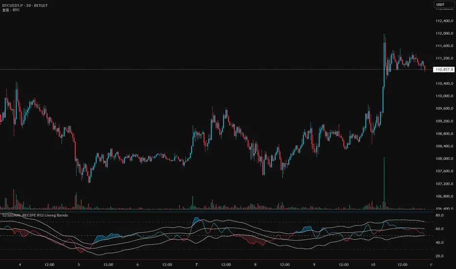
52SIGNAL RECIPE RSI Linreg Bands═══ 52SIGNAL RECIPE RSI Linreg Bands ═══
◆ Overview
52SIGNAL RECIPE RSI Linreg Bands is an advanced technical indicator that combines the RSI (Relative Strength Index) with Linear Regression Bands. This indicator visualizes the volatility of the RSI using linear regression bands, helping to clearly identify overbought/oversold areas and more accurately capture potential trend reversal points.
─────────────────────────────────────
◆ Key Features
• RSI-Based Overbought/Oversold Analysis: Uses the traditional RSI indicator to identify overbought/oversold conditions in the market
• Integrated Linear Regression Bands: Applies linear regression analysis to the RSI to visually represent the direction and strength of trends
• Dual Overbought/Oversold Levels: Sets overbought/oversold levels for both RSI and Linear Regression Bands to increase the accuracy of signals
• Advanced Visualization: Intuitive chart analysis is possible with color changes according to trend direction and clear band display
• Multiple Alert Settings: Alert functions for various conditions ensure you don't miss important trading moments
─────────────────────────────────────
◆ Technical Foundation
■ RSI (Relative Strength Index)
• Basic Settings: 14-period RSI with 5-period Weighted Moving Average (WMA) applied
• Calculation Method: Measures the relative strength of gains and losses, expressed as a value between 0-100
• Overbought/Oversold Levels: Default values set to 70 (overbought) and 30 (oversold)
■ Linear Regression Bands
• Period: Default value of 100 days
• Deviation: Default value of 2.5 standard deviations
• Center Line: The center line of the linear regression analysis for the RSI values
• Band Width: Displays the range of volatility around the center line based on the calculated standard deviation
• Overbought/Oversold Levels: Default values set to 85 (overbought) and 15 (oversold)
─────────────────────────────────────
◆ Practical Applications
■ Identifying Trading Signals
• Buy Signal:
▶ When the RSI falls below the oversold level (30)
▶ When the lower band of the Linear Regression Bands falls below the oversold level (15)
▶ When both conditions are met simultaneously (extreme oversold state) - a strong buy signal
• Sell Signal:
▶ When the RSI rises above the overbought level (70)
▶ When the upper band of the Linear Regression Bands rises above the overbought level (85)
▶ When both conditions are met simultaneously (extreme overbought state) - a strong sell signal
■ Trend Analysis
• Uptrend: When the linear regression center line is rising and the RSI is moving above the midline (50)
• Downtrend: When the linear regression center line is falling and the RSI is moving below the midline (50)
• Trend Strength: The wider the gap between the bands, the greater the volatility; the narrower, the more stable the trend
■ Divergence Confirmation
• Bearish Divergence: Price forms a new high, but the RSI is lower than the previous high (potential bearish signal)
• Bullish Divergence: Price forms a new low, but the RSI is higher than the previous low (potential bullish signal)
─────────────────────────────────────
◆ Advanced Setting Options
■ RSI Setting Adjustments
• RSI Source: Selectable options include Close (default), Open, High, Low, HL2, HLC3, OHLC4, etc.
• RSI Length: Adjust to lower values for short-term volatility, higher values for long-term trends
■ Linear Regression Setting Adjustments
• Period: Use lower values (20-50) for short-term analysis, higher values (100-200) for long-term analysis
• Deviation: Higher values create wider bands (more signals), lower values create narrower bands (more accurate signals)
■ Overbought/Oversold Level Adjustments
• RSI Levels: Adjust to more extreme values (80/20) in highly volatile markets
• Linear Regression Band Levels: Adjustable to 90/10 or 80/20 depending on market conditions
─────────────────────────────────────
◆ Synergy with Other Indicators
• Bollinger Bands: Use alongside Bollinger Bands on the price chart to compare price volatility with RSI volatility
• MACD: Use with MACD for momentum and trend confirmation
• Fibonacci Retracement: Check RSI Linreg Bands signals with key support/resistance levels
• Moving Averages: Combine moving average crossovers with RSI Linreg Bands signals to improve reliability
─────────────────────────────────────
◆ Conclusion
52SIGNAL RECIPE RSI Linreg Bands provides a powerful and accurate technical analysis tool by combining traditional RSI with linear regression analysis. The dual overbought/oversold system increases the accuracy of trading signals and clearly visualizes trend direction and strength to help traders make decisions. You can achieve optimal results by adjusting various settings to match your trading style and market conditions.
─────────────────────────────────────
※ Disclaimer: Past performance does not guarantee future results. Always use appropriate risk management strategies.
═══ 52SIGNAL RECIPE RSI 선형회귀 밴드 ═══
◆ 개요
52SIGNAL RECIPE RSI 선형회귀 밴드는 RSI(상대강도지수)와 선형회귀 밴드를 결합한 고급 기술적 지표입니다. 이 지표는 선형회귀 밴드를 사용하여 RSI의 변동성을 시각화하여 과매수/과매도 영역을 명확하게 식별하고 잠재적인 추세 반전 지점을 더 정확하게 포착하는 데 도움을 줍니다.
─────────────────────────────────────
◆ 주요 특징
• RSI 기반 과매수/과매도 분석: 전통적인 RSI 지표를 사용하여 시장의 과매수/과매도 상태를 식별
• 통합된 선형회귀 밴드: RSI에 선형회귀 분석을 적용하여 추세의 방향과 강도를 시각적으로 표현
• 이중 과매수/과매도 레벨: RSI와 선형회귀 밴드 모두에 과매수/과매도 레벨을 설정하여 신호의 정확도 향상
• 고급 시각화: 추세 방향에 따른 색상 변화와 명확한 밴드 표시로 직관적인 차트 분석 가능
• 다중 알림 설정: 다양한 조건에 대한 알림 기능으로 중요한 트레이딩 시점을 놓치지 않도록 보장
─────────────────────────────────────
◆ 기술적 기반
■ RSI (상대강도지수)
• 기본 설정: 14기간 RSI에 5기간 가중이동평균(WMA) 적용
• 계산 방법: 상승과 하락의 상대적 강도를 측정하여 0-100 사이의 값으로 표현
• 과매수/과매도 레벨: 기본값으로 70(과매수)과 30(과매도) 설정
■ 선형회귀 밴드
• 기간: 기본값 100일
• 편차: 기본값 2.5 표준편차
• 중심선: RSI 값에 대한 선형회귀 분석의 중심선
• 밴드 폭: 계산된 표준편차에 기반하여 중심선 주변의 변동성 범위 표시
• 과매수/과매도 레벨: 기본값으로 85(과매수)와 15(과매도) 설정
─────────────────────────────────────
◆ 실용적 응용
■ 트레이딩 신호 식별
• 매수 신호:
▶ RSI가 과매도 레벨(30) 아래로 떨어질 때
▶ 선형회귀 밴드의 하단이 과매도 레벨(15) 아래로 떨어질 때
▶ 두 조건이 동시에 충족될 때(극단적 과매도 상태) - 강한 매수 신호
• 매도 신호:
▶ RSI가 과매수 레벨(70) 위로 상승할 때
▶ 선형회귀 밴드의 상단이 과매수 레벨(85) 위로 상승할 때
▶ 두 조건이 동시에 충족될 때(극단적 과매수 상태) - 강한 매도 신호
■ 추세 분석
• 상승 추세: 선형회귀 중심선이 상승하고 RSI가 중간선(50) 위로 움직일 때
• 하락 추세: 선형회귀 중심선이 하락하고 RSI가 중간선(50) 아래로 움직일 때
• 추세 강도: 밴드 사이의 간격이 넓을수록 변동성이 크고, 좁을수록 추세가 안정적
■ 다이버전스 확인
• 약세 다이버전스: 가격이 신고점을 형성하지만 RSI가 이전 고점보다 낮을 때(잠재적 약세 신호)
• 강세 다이버전스: 가격이 신저점을 형성하지만 RSI가 이전 저점보다 높을 때(잠재적 강세 신호)
─────────────────────────────────────
◆ 고급 설정 옵션
■ RSI 설정 조정
• RSI 소스: 선택 가능한 옵션에는 종가(기본값), 시가, 고가, 저가, HL2, HLC3, OHLC4 등이 포함
• RSI 길이: 단기 변동성을 위해 낮은 값으로, 장기 추세를 위해 높은 값으로 조정
■ 선형회귀 설정 조정
• 기간: 단기 분석을 위해 낮은 값(20-50), 장기 분석을 위해 높은 값(100-200) 사용
• 편차: 높은 값은 더 넓은 밴드(더 많은 신호), 낮은 값은 더 좁은 밴드(더 정확한 신호) 생성
■ 과매수/과매도 레벨 조정
• RSI 레벨: 변동성이 큰 시장에서는 더 극단적인 값(80/20)으로 조정
• 선형회귀 밴드 레벨: 시장 상황에 따라 90/10 또는 80/20으로 조정 가능
─────────────────────────────────────
◆ 다른 지표와의 시너지
• 볼린저 밴드: 가격 차트의 볼린저 밴드와 함께 사용하여 가격 변동성과 RSI 변동성 비교
• MACD: 모멘텀과 추세 확인을 위해 MACD와 함께 사용
• 피보나치 되돌림: RSI 선형회귀 밴드 신호를 주요 지지/저항 레벨과 함께 확인
• 이동평균선: 이동평균 교차와 RSI 선형회귀 밴드 신호를 결합하여 신뢰성 향상
─────────────────────────────────────
◆ 결론
52SIGNAL RECIPE RSI 선형회귀 밴드는 전통적인 RSI와 선형회귀 분석을 결합하여 강력하고 정확한 기술적 분석 도구를 제공합니다. 이중 과매수/과매도 시스템은 트레이딩 신호의 정확도를 높이고 추세 방향과 강도를 명확하게 시각화하여 트레이더의 의사 결정을 돕습니다. 다양한 설정을 트레이딩 스타일과 시장 상황에 맞게 조정하여 최적의 결과를 얻을 수 있습니다.
─────────────────────────────────────
※ 면책 조항: 과거 성과가 미래 결과를 보장하지 않습니다. 항상 적절한 리스크 관리 전략을 사용하세요.
Triple Differential Moving Average BraidThe Triple Differential Moving Average Braid weaves together three distinct layers of moving averages—short-term, medium-term, and long-term—providing a structured view of market trends across multiple time horizons. It is an integrated construct optimized exclusively for the 1D timeframe. For multi-timeframe analysis and/or trading the lower 1h and 15m charts, it pairs well the Granular Daily Moving Average Ribbon ... adjust the visibility settings accordingly.
Unlike traditional moving average indicators that use a single moving average crossover, this braid-style system incorporates both SMAs and EMAs. The dual-layer approach offers stability and responsiveness, allowing traders to detect trend shifts with greater confidence.
Users can, of course, specify their own color scheme. The indicator consists of three layered moving average pairs. These are named per their default colors:
1. Silver Thread – Tracks immediate price momentum.
2. Royal Guard – Captures market structure and developing trends.
3. Golden Section – Defines major market cycles and overall trend direction.
Each layer is color-coded and dynamically shaded based on whether the faster-moving average is above or below its slower counterpart, providing a visual representation of market strength and trend alignment.
🧵 Silver Thread
The Silver Thread is the fastest-moving layer, comprising the 21D SMA and a 21D EMA. The choice of 21 is intentional, as it corresponds to approximately one full month of trading days in a 5-day-per-week market and is also a Fibonacci number, reinforcing its use in technical analysis.
· The 21D SMA smooths out recent price action, offering a baseline for short-term structure.
· The 21D EMA reacts more quickly to price changes, highlighting shifts in momentum.
· When the SMA is above the EMA, price action remains stable.
· When the SMA falls below the EMA, short-term momentum weakens.
The Silver Thread is a leading indicator within the system, often flipping direction before the medium- and long-term layers follow suit. If the Silver Thread shifts bearish while the Royal Guard remains bullish, this can signal a temporary pullback rather than a full trend reversal.
👑 Royal Guard
The Royal Guard provides a broader perspective on market momentum by using a 50D EMA and a 200D EMA. EMAs prioritize recent price data, making this layer faster-reacting than the Golden Section while still offering a level of stability.
· When the 50D EMA is above the 200D EMA, the market is in a confirmed uptrend.
· When the 50D EMA crosses below the 200D EMA, momentum has shifted bearish.
This layer confirms medium-term trend structure and reacts more quickly to price changes than traditional SMAs, making it especially useful for trend-following traders who need faster confirmation than the Golden Section provides.
If the Silver Thread flips bearish while the Royal Guard remains bullish, traders may be seeing a momentary dip in an otherwise intact uptrend. Conversely, if both the Silver Thread and Royal Guard shift bearish, this suggests a deeper pullback or possible trend reversal.
📜 Golden Section
The Golden Section is the slowest and most stable layer of the system, utilizing a 50D SMA and a 200D SMA—a classic combination used by long-term traders and institutions.
· When the 50D SMA is above the 200D SMA the market is in a strong, sustained uptrend.
· When the 50D SMA falls below the 200D SMA the market is structurally bearish.
Because SMAs give equal weight to past price data, this layer moves slowly and deliberately, ensuring that false breakouts or temporary swings do not distort the bigger picture.
Traders can use the Golden Section to confirm major market trends—when all three layers are bullish, the market is strongly trending upward. If the Golden Section remains bullish while the Royal Guard turns bearish, this may indicate a medium-term correction within a larger uptrend rather than a full reversal.
🎯 Swing Trade Setups
Swing traders can benefit from the multi-layered approach of this indicator by aligning their trades with the overall market structure while capturing short-term momentum shifts.
· Bullish: Look for Silver Thread and Royal Guard alignment before entering. If the Silver Thread flips bullish first, anticipate a momentum shift. If the Royal Guard follows, this confirms a strong medium-term move.
· Bearish: If the Silver Thread turns bearish first, it may signal an upcoming reversal. Waiting for the Royal Guard to follow adds confirmation.
· Confirmation: If the Golden Section remains bullish, a pullback may be an opportunity to enter a trend continuation trade rather than exit prematurely.
🚨 Momentum Shifts
· If the Silver Thread flips bearish but the Royal Guard remains bullish, traders may opt to buy the dip rather than exit their positions.
· If both the Silver Thread and Royal Guard turn bearish, traders should exercise caution, as this suggests a more significant correction.
· When all three layers align in the same direction the market is in a strong trending phase, making swing trades higher probability.
⚠️ Risk Management
· A narrowing of the shaded areas suggests trend exhaustion—consider tightening stop losses.
· When the Golden Section remains bullish, but the other two layers weaken, potential support zones to enter or re-enter positions.
· If all three layers flip bearish, this may indicate a larger trend reversal, prompting an exit from long positions and/or consideration of short setups.
The Triple Differential Moving Average Braid is layered, structured tool for trend analysis, offering insights across multiple timeframes without requiring traders to manually compare different moving averages. It provides a powerful and intuitive way to read the market. Swing traders, trend-followers, and position traders alike can use it to align their trades with dominant market trends, time pullbacks, and anticipate momentum shifts.
By understanding how these three moving average layers interact, traders gain a deeper, more holistic perspective of market structure—one that adapts to both momentum-driven opportunities and longer-term trend positioning.

Waldo Momentum Cloud Bollinger Bands (WMCBB)
Title: Waldo Momentum Cloud Bollinger Bands (WMCBB)
Description:
Introducing the "Waldo Momentum Cloud Bollinger Bands (WMCBB)," an innovative trading tool crafted for those who aim to deepen their market analysis by merging two dynamic technical indicators: Dynamic RSI Bollinger Bands and the Waldo Cloud.
What is this Indicator?
WMCBB integrates the volatility-based traditional Bollinger Bands with a momentum-sensitive approach through the Relative Strength Index (RSI). Here’s how it works:
Dynamic RSI Bollinger Bands: These bands dynamically adjust according to the RSI, which tracks the momentum of price movements. By scaling the RSI to align with price levels, we generate bands that not only reflect market volatility but also the underlying momentum, offering a refined view of overbought and oversold conditions.
Waldo Cloud: This feature adds a layer of traditional Bollinger Bands, visualized as a 'cloud' on your chart. It employs standard Bollinger Band methodology but enhances it with additional moving average layers to better define market trends.
The cloud's color changes dynamically based on various market conditions, providing visual signals for trend direction and potential trend reversals.
Why Combine These Indicators?
Combining Dynamic RSI Bollinger Bands with the Waldo Cloud in WMCBB aims to:
Enhance Trend Identification: The Waldo Cloud's color-coded system aids in recognizing the overarching market trend, while the Dynamic RSI Bands give insights into momentum changes within that trend, offering a comprehensive view.
Improve Volatility and Momentum Analysis: While traditional Bollinger Bands measure market volatility, integrating RSI adds a layer of momentum analysis, potentially leading to more accurate trading signals.
Visual Clarity: The unified color scheme for both sets of bands, which changes according to RSI levels, moving average crossovers, and price positioning, simplifies the process of gauging market sentiment at a glance.
Customization: Users have the option to toggle the visibility of moving averages (MA) through the settings, allowing for tailored analysis based on individual trading strategies.
Usage:
Utilize WMCBB to identify potential trend shifts by observing price interactions with the dynamic bands or changes in the Waldo Cloud's color.
Watch for divergences between price movements and RSI to forecast potential market reversals or continuations.
This combination shines in sideways markets where traditional indicators might fall short, as it provides additional context through RSI momentum analysis.
Settings:
Customize parameters for both the Dynamic RSI and Waldo Cloud Bollinger Bands, including the calculation source, standard deviation factors, and moving average lengths.
WMCBB is perfect for traders seeking to enhance their market analysis through the synergy of momentum and volatility, all while maintaining visual simplicity. Trade with greater insight using the Waldo Momentum Cloud Bollinger Bands!

UVR Crypto TrendINDICATOR OVERVIEW: UVR CRYPTO TREND
The UVR Crypto Trend indicator is a custom-built tool designed specifically for cryptocurrency markets, utilizing advanced volatility, momentum, and trend-following techniques. It aims to identify trend reversals and provide buy and sell signals by analyzing multiple factors, such as price volatility(UVR), RSI (Relative Strength Index), CMF (Chaikin Money Flow), and EMA (Exponential Moving Average). The indicator is optimized for CRYPTO MARKETS only.
KEY FEATURES AND HOW IT WORKS
Volatility Analysis with UVR
The UVR (Ultimate Volatility Rate) is a proprietary calculation that measures market volatility by comparing significant price extremes and smoothing the data over time.
Purpose: UVR aims to reduce noise in low-volatility environments and highlight significant movements during higher-volatility periods. While it strives to improve filtering in low-volatility conditions, it does not guarantee perfect performance, making it a balanced and adaptable tool for dynamic markets like cryptocurrency.
HOW UVR (ULTIMATE VOLATILITY RATE) IS CALCULATED
UVR is calculated using a method that ensures precise measurement of market volatility by comparing price extremes across consecutive candles:
Volatility Components:
Two values are calculated to represent potential price fluctuations:
The absolute difference between the current candle's high and the previous candle's low:
Volatility Component 1=∣High−Low ∣
The absolute difference between the previous candle's high and the current candle's low:
Volatility Component 2=∣High −Low∣
Volatility Ratio:
The larger of the two components is selected as the Volatility Ratio, ensuring UVR captures the most significant movement:
Volatility Ratio=max(Volatility Component 1,Volatility Component 2)
Smoothing with SMMA:
To stabilize the volatility calculation, the Volatility Ratio is smoothed using a Smoothed Moving Average (SMMA) over a user-defined period (e.g., 14 candles):
UVR=(UVR(Previous)×(Period−1)+Volatility Ratio)/Period
This calculation ensures UVR adapts dynamically to market conditions, focusing on significant price movements while filtering out noise.
RSI FOR MOMENTUM DETECTION
RSI (Relative Strength Index) identifies overbought and oversold conditions.
Trend Confirmation at the 50 Level
RSI values crossing above 50 signal the potential start of an upward trend.
RSI values crossing below 50 indicate the potential start of a downward trend.
Key Reversals at Extreme Levels
RSI detects trend reversals at overbought (>70) and oversold (<30) levels.
For example:
Overbought Trend Reversal: RSI >70 followed by bearish price action signals a potential downtrend.
Oversold Trend Reversal: RSI <30 with bullish confirmation signals a potential uptrend.
Rare Extreme RSI Readings
Extreme levels, such as RSI <12 (oversold) or RSI >88 (overbought), are used to identify rare yet powerful reversals.
---HOW IT DIFFERS FROM OTHER INDICATORS---
Using UVR High and Low Values
The Ultimate Volatility Rate (UVR) focuses on analyzing the high and low price ranges of the market to measure volatility.
Unlike traditional trend indicators that rely primarily on momentum or moving average crossovers, UVR leverages price extremes to better identify trend reversals.
This approach ensures fewer false signals during low-volatility phases and more accurate trend detection during high-volatility conditions.
UVR as the Core Component
The indicator is fundamentally built around UVR as the primary filter, while supporting tools like RSI (momentum detection), CMF (volume confirmation), and EMA (trend validation) complement its functionality.
By integrating these additional components, the indicator provides a multidimensional analysis rather than relying solely on a single approach.
Dynamic Adaptation to Volatility
UVR dynamically adjusts to market conditions, striving to improve filtering in low-volatility phases. While not flawless, this approach minimizes false signals and adapts more effectively to varying levels of market activity.
Trend Clouds for Visual Guidance
UVR-based dynamic clouds visually mark high and low price areas, highlighting potential consolidation or retracement zones.
These clouds serve as guides for setting stop-loss or take-profit levels, offering clear risk management strategies.
BUY AND SELL SIGNAL LOGIC
BUY CONDITIONS
Momentum-Based Buy-Entry
RSI >50, CMF >0, and the close price is above EMA50.
The price difference between open and close exceeds a threshold based on UVR.
Oversold Reversal
RSI <30 and CMF >0 with a strong bullish candle (close > open and UVR-based sensitivity filter).
Breakout Confirmation
The price breaks above a previously identified resistance, with conditions for RSI and CMF supporting the breakout.
Reversal from Oversold RSI Extreme
RSI <12 on the previous candle with a strong rebound on the current candle with UVR confirmation filter.
SELL CONDITIONS
Momentum-Based Sell-Entry
RSI <50, CMF <0, and the close price is below EMA50.
The price difference between open and close exceeds the UVR threshold.
Overbought Reversal
RSI >70 with bearish price action (open > close and UVR-based sensitivity filter).
Breakdown Confirmation
The price breaks below a previously identified support, with RSI and CMF supporting the breakdown.
Reversal from Overbought RSI Extreme
RSI >88 on the previous candle with a bearish confirmation on the current candle with UVR confirmation filter.
BUY AND SELL SIGNALS VISUALIZATION
The UVR Crypto Trend Indicator visually represents buy and sell conditions using dynamic plots, making it easier for traders to interpret and act on the signals. Below is an explanation of the visual representation:
Buy Signals and Visualization
Signal Trigger:
A buy signal is generated when one of the defined Buy Conditions is met (e.g., RSI >50, CMF >0, price above EMA50).
Visual Representation:
A blue upward arrow appears at the candle where the buy condition is triggered.
A blue cloud forms above the price candles, representing the strength of the bullish trend. The cloud dynamically adapts to market volatility, using the UVR calculation to mark support zones or consolidation levels.
Purpose of the Blue Cloud:
It acts as a visual guide for price movements and stay horizontal when the trend is not moving up
Sell Signals and Visualization
Signal Trigger:
A sell signal is generated when one of the defined Sell Conditions is met (e.g., RSI <50, CMF <0, price below EMA50).
Visual Representation:
A red downward arrow appears at the candle where the sell condition is triggered.
A red cloud forms below the price candles, representing the strength of the bearish trend. Like the blue cloud, it uses the UVR calculation to dynamically mark resistance zones or potential retracement levels.
Purpose of the Red Cloud:
It acts as a visual guide for price movements and stay horizontal when the trend is not moving down.
CONCLUSION
The UVR Crypto Trend indicator provides a powerful tool for trend reversal detection by combining volatility analysis, momentum confirmation, and trend-following techniques. Its unique use of the Ultimate Volatility Rate (UVR) as a core element, supported by proven indicators like RSI, CMF, and EMA, ensures reliable and actionable signals tailored for the crypto market's dynamic nature. By leveraging UVR’s high and low price range analysis, it achieves a level of precision that traditional indicators lack, making it a high-performing system for cryptocurrency traders.

Relative Strength Index Custom [BRTLab]RSI Custom — Strategy-Oriented RSI with Multi-Timeframe Precision
The Relative Strength Index Custom is designed with a focus on developing robust trading strategies. This powerful indicator leverages the logic of calculating RSI on higher timeframes (HTFs) while allowing traders to execute trades on lower timeframes (LTFs). Its unique ability to extract accurate RSI data from higher timeframes without waiting for those candles to close provides a real-time advantage, eliminating the "look-ahead" bias that often
distorts backtest results.
Key Features
Multi-Timeframe RSI for Strategy Development
This indicator stands out by allowing you to calculate RSI on higher timeframes, even while operating on lower timeframe charts. This means you can, for example, calculate RSI on the 1-hour or daily chart and execute trades on a 1-minute chart without needing to wait for the higher timeframe candle to close. This feature is crucial for strategy-building as it eliminates backtesting issues where data from the future is inadvertently used, providing more reliable backtest results.
Example: On a 15-minute chart, you can use the 1-hour RSI to open positions based on higher timeframe momentum, but you get this signal in real-time, improving timing and accuracy.
Accurate Data Extraction from Higher Timeframes
The indicator's custom logic ensures that accurate RSI data is retrieved from higher timeframes, providing an edge by delivering timely information for lower timeframe decisions. This prevents delayed signals often encountered when waiting for higher timeframe candles to close, which is crucial for high-frequency and intraday traders looking for precise entries based on multi-timeframe data.
Customizable RSI Settings for Strategy Tuning
The script offers full customization of the RSI, including length and source price (close, open, high, or low), allowing traders to tailor the RSI to fit specific trading strategies. These settings are housed in the "RSI Settings" section, enabling precise adjustments that align with your overall strategy.
No Future-Looking in Backtests
Traditional backtests often suffer from "future-looking" bias, where calculations unintentionally use data from candles that haven’t yet closed. This indicator is specifically designed to prevent such issues by calculating RSI values in real-time. This is particularly important when creating and testing strategies, as it ensures that the conditions under which trades would have been made are accurately represented in historical tests.
RSI-Based Moving Average for Additional Filtering
The built-in moving average (MA) based on RSI values helps filter out noise, making it easier to identify genuine trend shifts. This is particularly useful in strategies where moving average crossovers act as additional confirmation for trade entries and exits.
Overbought and Oversold Zone Detection
Visual gradient fills on the RSI chart help traders identify overbought and oversold zones (above 70 and below 30, respectively). These zones are crucial for timing reversal trades or confirming momentum-based strategies.
How This Indicator Enhances Your Strategy
Increased Accuracy for Intraday Strategies
For traders who operate on lower timeframes, using higher timeframe RSI data gives a broader perspective of market momentum while still maintaining precision for short-term trade entries. The real-time data extraction means you don't need to wait for HTF candles to close, which can dramatically improve your entry timing.
Strategic Edge in Backtesting
One of the greatest challenges in backtesting strategies is avoiding future-looking bias. This indicator is built to overcome this by using real-time multi-timeframe data, ensuring the accuracy and reliability of historical strategy testing, which provides confidence in your strategies when applied to live markets.
Advanced Filtering for Trend Strategies
By combining the RSI values with a customizable moving average (MA) and visualizing key momentum zones with overbought/oversold fills, the indicator allows for more refined trade filters. This ensures that signals generated by your strategy are based on solid momentum data and not short-term price fluctuations.

Gabriels Trend Regularity Adaptive Moving Average Dragon This is an improved version of the trend following Williams Alligator, through the use of five Trend Regularity Adaptive Moving Averages (TRAMA) instead of three smoothed averages (SMMA). This indicator can double as a TRAMA Ribbon indicator by reducing the offset to zero. Whereas the active offset can double as a forecasting indicator for options and futures.
This indicator uses five TRAMAs, set at 8, 21, 55, 144, and 233 periods. They make up the Lips, Teeth, Jaws, Wings, and Tail of the Dragon. This indicator uses convergence-divergence relationships to build trading signals, with the Tail making the slowest turns and the Lips making the fastest turns. The Lips crossing downwards through the other lines signal a short opportunity, whereas Lips crossing upwards through other lines signal a buying opportunity. The downward cross can be referred to as the Dragon "Sleeping" , and the upward cross as the Dragon "Awakening" .
In particular, but not limited to, the Wings and Tail movements possess a Roar-like forecast effect on the market. Respectively, they can be referred to as the Dragon "Spreading its Wings" or "Swinging its Tail" .
The first three lines, stretching apart and constantly moving higher or lower, denote periods in which long or short equity positions should be managed and maintained. This can be referred to as the Dragon "Eating with a mouth wide open" . Whereas indicator lines converging into narrow bands and shifting into a horizontal position can denote a trending period coming to an end, signaling the need for profit-taking and position realignment. Conversely, a previous flat line moving can denote a new trending period starting.
This indicator can double as a Multiple TRAMAs indicator by reducing the offset to zero. As such, very interesting results can be observed when used in a moving average crossover system such as the Williams Alligator or as trailing support and resistance.
The following moving average adapts to the average of the highest high and lowest low made over a specific period, thus adapting to trend strength. The TRAMA can be used like most moving averages, with the advantage of being smoother during ranging markets because it is calculated through exponential averaging.
It is calculating, using a smoothing factor, the squared simple moving average of the number of highest highs or lowest lows previously made. Where the highest highs and lowest lows are calculated using rolling maximums and minimums. Therefore, squaring allows the moving average to penalize lower values, thus appearing stationary during ranging markets.
As with all moving averages, it is still a lagging indicator, and it can suffer whipsaws when the market moves too violently or when it consolidates in ranging conditions. Despite it working in all timeframes, it won't be as formidable in the 1–5-minute scalping timeframes due to that. I would suggest 5 to 45 minutes if you are a swing trader, or hourly, daily, and weekly if you are a long-term investor.
I hope you enjoy this indicator! It's the first indicator I made, so constructive criticism would be appreciated. Thanks!
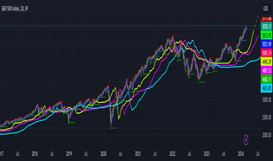
Average sector correlations to SPYHello Traders!
This is our latest addition to MFR TradingView account: Average sector correlations to SPY.
The Average Sector Correlation indicator is a powerful tool designed to give insights into the interconnectedness of different SPY sectors in relation to the SPY itself. As an introduction, know that this indicator presents the average correlation of all SPY sectors, serving as a barometer for overall market cohesion and relative performance.
At Myfractalrange, we monitor correlations extensively as we know they serve as warning for reversals, bullish rallies, bear market allies, etc.
Before going into how subscribers can use this script, let't have a look at the different data points:
In this script, we are calculating the average sector correlations to the SPY (S&P 500 ETF).
The following data points are used for the calculation:
- XLK: Technology Select Sector SPDR Fund
- XLE: Energy Select Sector SPDR Fund
- XLF: Financial Select Sector SPDR Fund
- XLU: Utilities Select Sector SPDR Fund
- XLV: Health Care Select Sector SPDR Fund
- XLP: Consumer Staples Select Sector SPDR Fund
- XLI: Industrial Select Sector SPDR Fund
- XLY: Consumer Discretionary Select Sector SPDR Fund
- XLC: Communication Services Select Sector SPDR Fund
- XLRE: Real Estate Select Sector SPDR Fund
- XLB: Materials Select Sector SPDR Fund
These data points represent different sectors of the stock market.
The user can modify the "period" variable to specify the lookback period for calculating the correlation.
By changing the value of "Period," the user can adjust the number of historical data points used in the correlation calculation. Default value is 10 days.
How does the script work?
The script uses the ta.correlation function from TradingView's Pine Script to calculate the correlation between the daily returns of each sector ETF and the SPY. The daily return is calculated as the percentage change in price from the previous day.
The correlation calculation is performed for each sector ETF and the SPY, using the specified lookback period. The correlations are then averaged to obtain the average sector correlation to the SPY.
The resulting average sector correlation is plotted on the chart using a blue line.
How to use correlations when trading?
This script can be used to assess the overall market sentiment by measuring the average sector correlation to the SPY. When the average sector correlation is positive, it indicates that the sectors are generally moving in the same direction as the broader market (SPY). This suggests a strong market trend.
Traders can use this information to make informed trading decisions. For example, if the average sector correlation is strongly positive, it may be a signal to consider bullish positions in individual stocks or ETFs from sectors with high positive correlations. Conversely, if the average sector correlation is negative or weak, it may indicate a lack of market direction or potential sector rotation, requiring caution in trading decisions.
Furthermore, when correlation values are high and growing, it may signify a build-up of risk, suggesting that the sectors are moving in tandem due to widespread market forces. This can often be a signal of broader market participants chasing trends or reacting to panic. Therefore, this indicator can serve as a valuable tool for traders and investors who want to understand market sentiment and systemic risk at a glance.
The Average Sector Correlation indicator also provides the capability to monitor average correlations across multiple timeframes concurrently. This feature allows users to track the fluctuations of sector correlations over short, medium, and long-term periods, all simultaneously.
This function offers a more comprehensive view of the market dynamics and can alert users to changes in correlation patterns over various time horizons. Thus, users can gain insights into the immediate temperament of the market while also maintaining awareness of larger trends that may be forming or diminishing over extended periods. It presents a holistic image of market behaviour, enhancing the user's decision-making process.
Why use Correlations in combination with other indicators?
To enhance trading strategies, this script can be used in combination with other technical indicators or signals. By incorporating additional indicators such as moving averages, trend lines, or oscillators, traders can build a comprehensive trading system.
For example, traders can use the average sector correlation as a confirmation signal for other technical analysis tools. If a bullish signal is generated by another indicator, such as a moving average crossover or a breakout, the positive average sector correlation can provide additional confidence to enter or hold a long position.
Conversely, if a bearish signal is generated by another indicator, a negative average sector correlation can act as a confirmation signal to consider short positions or reduce exposure to sectors with low or negative correlations.
By combining multiple signals and indicators, traders can develop a well-rounded trading strategy that incorporates market breadth (sector correlations) along with other technical factors to increase the probability of successful trades.
It's important to note that while Correlations are a useful tool, it should not be relied upon solely for making trading decisions. It's recommended to use it in conjunction with other technical analysis tools and consider other factors such as Trend, market conditions, risk management, and fundamental analysis.
We hope that you will find these explanations useful.
Enjoy!
DISCLAIMER: No sharing, copying, reselling, modifying, or any other forms of use are authorised. This script is strictly for individual use and educational purposes only. This is not financial or investment advice. Investments are always made at your own risk and are based on your personal judgement. Myfractalrange is not responsible for any losses you may incur. Please invest wisely.
Easy Loot Golden CrossGolden/Death Cross Moving Average Indicator
30, 100 & 200 period Simple Moving Average (SMA).
30 = Yellow
100 = Green
200 = Black
Black crosses mark the 'golden crosses' as well as the 'death crosses'. These black crosses appear when the 30 crosses the 100 & when the 100 crosses the 200. These black crosses don't tell you when to buy/sell, but simply indicate interest in the market.
This code is open-source so feel free to add this indicator to your chart and play around with the different moving average timeframes & color schemes.
Golden Cross
The golden cross occurs when a short-term moving average crosses over a major long-term moving average to the upside and is interpreted by analysts and traders as signaling a definitive upward turn in a market. Basically, the short-term average trends up faster than the long-term average, until they cross.
There are three stages to a golden cross:
A downtrend that eventually ends as selling is depleted
A second stage where the shorter moving average crosses up through the longer moving average
Finally, the continuing uptrend, hopefully leading to higher prices
Death Cross
Conversely, a similar downside moving average crossover constitutes the death cross and is understood to signal a decisive downturn in a market. The death cross occurs when the short term average trends down and crosses the long-term average, basically going in the opposite direction of the golden cross.
The death cross preceded the economic downturns in 1929, 1938, 1974, and 2008.

Patreon Moving AverageThe Patreon moving average (PMA) is an adaptive moving average specifically designed to provide an optimal fit with the price while having a minimum amount of lag. The PMA can act as a fast-moving average for moving averages crossover system, detect trends, and filter out noisy variations from the price. The PMA is simple to use and interpret, and can be a really nice addition to your strategies, especially if they are based on moving averages.
The PMA integrates alerts based on the trend direction detected by the PMA.
Settings
Length: Determine the degree of filtering of the PMA.
Factor: Determine the sensitivity of the PMA to price variations, with higher values making the PMA less sensitive to price variations.
Decay: When higher than 0, introduce progressive smoothing, values closer to 0 return a faster progressive smoothing.
Src: Source input of the indicator.
Detect Trends With The PMA
The color of the PMA is related to the detected trend, with a blue color associated with an up-trend and a red color associated with a down-trend.
Higher values of Factor allows us to spot longer-term trends as well as filtering retracement in a trend.
Lower values of Length can also be used with higher values of Factor , this combination allows the PMA to actually be way less sensitive to price variations, thus returning less false signals while keeping a good fit with the price.
PMA As A Fast Moving Average
The PMA tries to provide crosses with a slow-moving average at the exact moment price cross the slow MA while minimizing the number of false signals.
PMA (In blue), EMA (in green), and SMA as a slow-moving average (in red), the PMA provide faster crosses while returning less false signals.
Progressive Smoothing
Progressive smoothing is obtained by using the Decay setting and allows the PMA to fit the price during extremely volatile markets and allows to preserve the structure of higher high's and lower low's.
Progressive smoothing can also minimize false signals.
In green/orange the PMA without progressive smoothing, in blue/red the PMA with progressive smoothing.
Finally progressive smoothing can give predictive and accurate estimates of the price central tendency
In green the mean of the price with a window size equal to the period the PMA is red, we can see that the PMA converges toward it extremely fast.
How To Access
The indicator is one of the "Patreon trend following indicators", and can only be used by my Patreons, you can become a Patreon by using the link on my signature.

Combo Strategy 123 Reversal & EMA & MA Crossover This is combo strategies for get a cumulative signal.
First strategy
This System was created from the Book "How I Tripled My Money In The
Futures Market" by Ulf Jensen, Page 183. This is reverse type of strategies.
The strategy buys at market, if close price is higher than the previous close
during 2 days and the meaning of 9-days Stochastic Slow Oscillator is lower than 50.
The strategy sells at market, if close price is lower than the previous close price
during 2 days and the meaning of 9-days Stochastic Fast Oscillator is higher than 50.
Second strategy
The Moving Average Crossover trading strategy is possibly the most popular
trading strategy in the world of trading. First of them were written in the
middle of XX century, when commodities trading strategies became popular.
This strategy is a good example of so-called traditional strategies.
Traditional strategies are always long or short. That means they are never
out of the market. The concept of having a strategy that is always long or
short may be scary, particularly in today’s market where you don’t know what
is going to happen as far as risk on any one market. But a lot of traders
believe that the concept is still valid, especially for those of traders who
do their own research or their own discretionary trading.
This version uses crossover of moving average and its exponential moving average.
WARNING:
- For purpose educate only
- This script to change bars colors.

Simple Moving Averages Alert Scriptcan set alerts on 3 moving averages (crossovers) , experiment with different moving average lengths in the input settings menu, there is also a toggle switch which turns off the 3rd moving average being used as a stop.
will add a backtesting version at some point
Multiple Moving Averages Alerts ScriptAlerts script that has triggers on multiple moving average crossovers so that profit is maximised, it also has an optional control moving average, enabled by default, that when active will stop trading when the price (first ma) is below the control moving average.
Source code is open so that others can use and modify
Click Below for Backtesting version:
Disclaimers, not an expert, not intended to be financial advise.
Biffy
Adaptive Signal IndicatorAdaptive Signal Indicator
Overview
The Adaptive Signal Indicator is a multi-timeframe confirmation system designed to help traders and investors identify potential entry and exit points. It automatically adjusts its analysis timeframes based on your chart's timeframe, providing consistent signal logic whether you're viewing 15-minute or weekly charts.
How It Works
This indicator combines multiple technical components that must align before generating a signal. However, the signal has a heavier weighting on price action because real investors know that "Only Price Pays." Additionally, rather than relying on a single indicator, it requires confirmation across several dimensions:
Trend Analysis — Evaluates short-term price structure using dual exponential moving averages
Wave Detection — Monitors momentum shifts using smoothed momentum calculations
Flow Tracking — Analyzes volume dynamics to confirm price movements have participation
Pulse Filter — Ensures signals align with the current directional bias of oscillator momentum
Macro Alignment — Checks higher-timeframe trend agreement before triggering signals
Drift Gate — Requires short-term trend confirmation on the daily timeframe
Cross Detection — Identifies key moving average crossovers on the daily timeframe
Range Position — Uses volatility bands to filter signals at extreme price levels
Signal Logic
Buy signals require:
Multiple bullish confirmations across different analysis methods
Macro trend not in bearish alignment
Pulse filter confirming upward momentum
Drift gate showing bullish daily bias
Sell signals require:
Bearish momentum confirmation
Macro trend not in bullish alignment
Pulse filter confirming downward momentum
Dashboard
Two real-time tables display:
Status Panel (Top Right)
Current state of all 8 analysis components
Color-coded for quick visual assessment
Shows conditions count and last signal status with % change since signal
Statistics Panel (Bottom Right)
Total signals generated
Success rate with win/loss breakdown
Average return per signal
Average winning and losing trade percentages
Profit factor
Maximum win and loss percentages
Key Features
✓ Adaptive Timeframes — Automatically selects appropriate analysis timeframes based on your chart
✓ Multiple Confirmations — Reduces false signals by requiring agreement across different analysis methods
✓ Clear Signals — Distinct BUY/SELL markers with no ambiguity
✓ Built-in Statistics — Track historical performance directly on chart
✓ Works on Any Market — Stocks, crypto, forex, indices, commodities
✓ Clean Visual Design — Overlay design keeps your chart readable
Best Practices
Use this indicator as one component of your overall trading plan
Consider your own risk management rules for position sizing and stop losses
Backtest on your preferred markets and timeframes before live trading
Signals work best in trending market conditions (the indicator filters for trend strength)
Who This Is For
Traders who prefer a systematic approach with clearly defined entry conditions. Suitable for swing trading and position trading timeframes. The multi-confirmation requirement means fewer signals, but each signal has passed multiple filters.
Note: Past performance shown in the statistics panel is based on historical data and does not guarantee future results. This indicator provides analysis tools to support your trading decisions—it is not financial advice. Always use proper risk management

The Bear & Bull TieWhat it does:
Bear & Bull Tie is a moving average crossover indicator that identifies trend reversals and generates entry/exit signals based on the relationship between price and three simple moving averages (SMA 21, SMA 55, SMA 89). The indicator combines these three MAs into an Average Moving Average (AMA) to confirm directional bias, then uses ATR (Average True Range) volatility measurement for dynamic position sizing and stop-loss placement.
How it works:
The indicator operates on a simple but effective principle: it enters a bullish trend when price closes above all three moving averages simultaneously, and enters a bearish trend when price closes below all three MAs simultaneously. This "three MA alignment" approach filters out noise and confirms genuine trend changes. The indicator then plots:
Entry levels at the highest MA during uptrends or lowest MA during downtrends
Stop-loss zones calculated using 2x ATR distance from entry prices
Trend confirmation fill between price and the Average Moving Average, color-coded blue for bullish and red for bearish
The ATR-based stop-loss sizing adapts to market volatility, making it suitable for different market conditions and timeframes.
How to use it:
Monitor the filled zones to visually confirm your trend bias
Watch for alerts when new long or short setups form; entry prices and ATR-based stops are displayed on the chart
Trade the zones between your entry level and stop-loss zone, adjusting position size based on your risk tolerance
Exit when colors reverse to indicate trend termination
The indicator works best on higher timeframes (1H and above) where trend clarity is stronger and false signals are reduced.
Alerts: FOR AUTOMATION / NOTIFICATION's (create an alert for B/B tie (2, 4) that uses Any Alert / Function Call )
Long Positions:
entries ---> "Bull Tie on NVDA | Entry : 100.5 | ATR Stop : 99.5"
exits ------> "Bull Tie on NVDA | Exit : 110.1"
Short Positions:
entries ---> "Bear Tie on NVDA | Entry : 120.05 | ATR Stop : 85.05"
exits -----> "Bear Tie on NVDA | Exit : 100"
Credits:
This script incorporates concepts and code portions from @LOKEN94 with his explicit permission. Special thanks for the foundational logic that inspired this development.
Disclaimer:
This indicator is for educational and analytical purposes. It is not financial advice. Past performance does not guarantee future results. Always manage risk properly and use stops. Test thoroughly on historical data before live trading.

Smart Dollar Cost Averaging DashboardThis closed-source TradingView indicator implements a comprehensive Dollar Cost Averaging (DCA) savings plan simulation designed to automate systematic investments. The script allows users to set a fixed investment amount and choose a customizable interval—weekly, monthly, or quarterly—at which purchases are simulated against historical or live price data. The core functionality calculates the average buy-in price dynamically by tracking cumulative invested capital and total acquired shares, providing a true average cost basis rather than simple price signals. This average price is visualized as a persistent, non-draggable horizontal line on the chart, enabling traders to intuitively compare the market price to their average entry point. A movable and toggleable dashboard accompanies the indicator, delivering real-time metrics including total investment, number of purchases, portfolio value, profit/loss both in absolute and percentage terms, and the price gap relative to the computed average buy-in. This transparency helps users understand their position’s health and supports disciplined long-term investment strategies. This script stands unique by combining flexible periodic investment scheduling with real capital calculations and detailed, easy-to-read visual feedback that is rarely bundled so intuitively in similar scripts. Unlike many open-source trend-following or scalping tools, this indicator focuses on systematic investment and passive portfolio growth, ideal for investors pursuing dollar cost averaging. Unlike standard buy/sell signal creators or simplistic moving average crossovers, this script models actual cash flow deployment and quantifies performance in real-time with a clean, professional UI. Its originality lies in marrying realistic capital flow simulation with intuitive visualization and multi-interval flexibility.
How It Works:
Tracks virtual investments of fixed cash amounts at user-defined intervals Converts invested amounts into shares based on closing prices, accumulating holding size Recalculates weighted average purchase price after each simulated buy Continuously displays the average buy-in as a stable graphic element on any price chart Offers detailed investment metrics through an interactive dashboard overlay Supports weekly, monthly, and quarterly investment cadences with user-selectable investment days Use Cases: Ideal for investors employing systematic savings plans to build long-term positions Fits cryptocurrency, stock, ETF, and index investments on TradingView Supports financial education by illustrating dollar cost averaging principles visually Facilitates performance tracking for passive investors who prioritize consistent buying over timing The script is an advanced tool meeting a distinct trading niche: systematic, cash-based, passive investment modeling with transparency and user control. This originality and usefulness justify the closed-source mode to protect intellectual property.

Trading SignalsThis script is designed to help identify high-probability trend reversal and continuation signals by combining moving average crossovers with momentum confirmation.
✨ How It Works:
EMA 200 — plots the 200-period Exponential Moving Average (EMA) of the closing price.
EMA-based SMA 200 — applies a 200-period Simple Moving Average (SMA) on top of the EMA values for smoother trend tracking.
Relative Strength Index (RSI) (Length 100) is used as a momentum filter to avoid false signals.
🟢 Buy Signal Conditions:
EMA 200 crosses above the EMA-based SMA 200.
RSI (100) is greater than 52, confirming bullish momentum.
🔴 Sell Signal Conditions:
EMA 200 crosses below the EMA-based SMA 200.
RSI (100) is less than 48, confirming bearish momentum.
[DEM] EMA Crossover Signal (With Backtesting) EMA Crossover Signal (With Backtesting) is designed to generate buy and sell signals based on the classic exponential moving average crossover strategy using two configurable EMA periods (default 9 and 21). It also includes a comprehensive backtesting framework to evaluate the historical performance of these signals. The indicator overlays directly on the price chart, plotting signals and displaying performance statistics in a table. The strategy generates buy signals when the shorter EMA crosses above the longer EMA (indicating upward momentum shift) and sell signals when the shorter EMA crosses below the longer EMA (indicating downward momentum shift), while the integrated backtesting system tracks signal accuracy, average returns, signal frequency per month, and total correct predictions for both buy and sell signals over a configurable holding period to help traders evaluate the effectiveness of the crossover parameters.
